2021 - 2022
Fannie Mae App Redesign
IOS Design
UI/UX
Finance
Agency: Matter Supply Co.
Team: Product Management, Developers, QA, Designers
Tools: Figma, Figjam, Notion, Airtable, Pitch
Overview: Designed a mobile app for Fannie Mae, aimed at simplifying the home-buying process for low-income consumers. The app consolidates essential mortgage information, providing easy, on-the-go access to support Fannie Mae's mission of making mortgages more accessible.
Situation
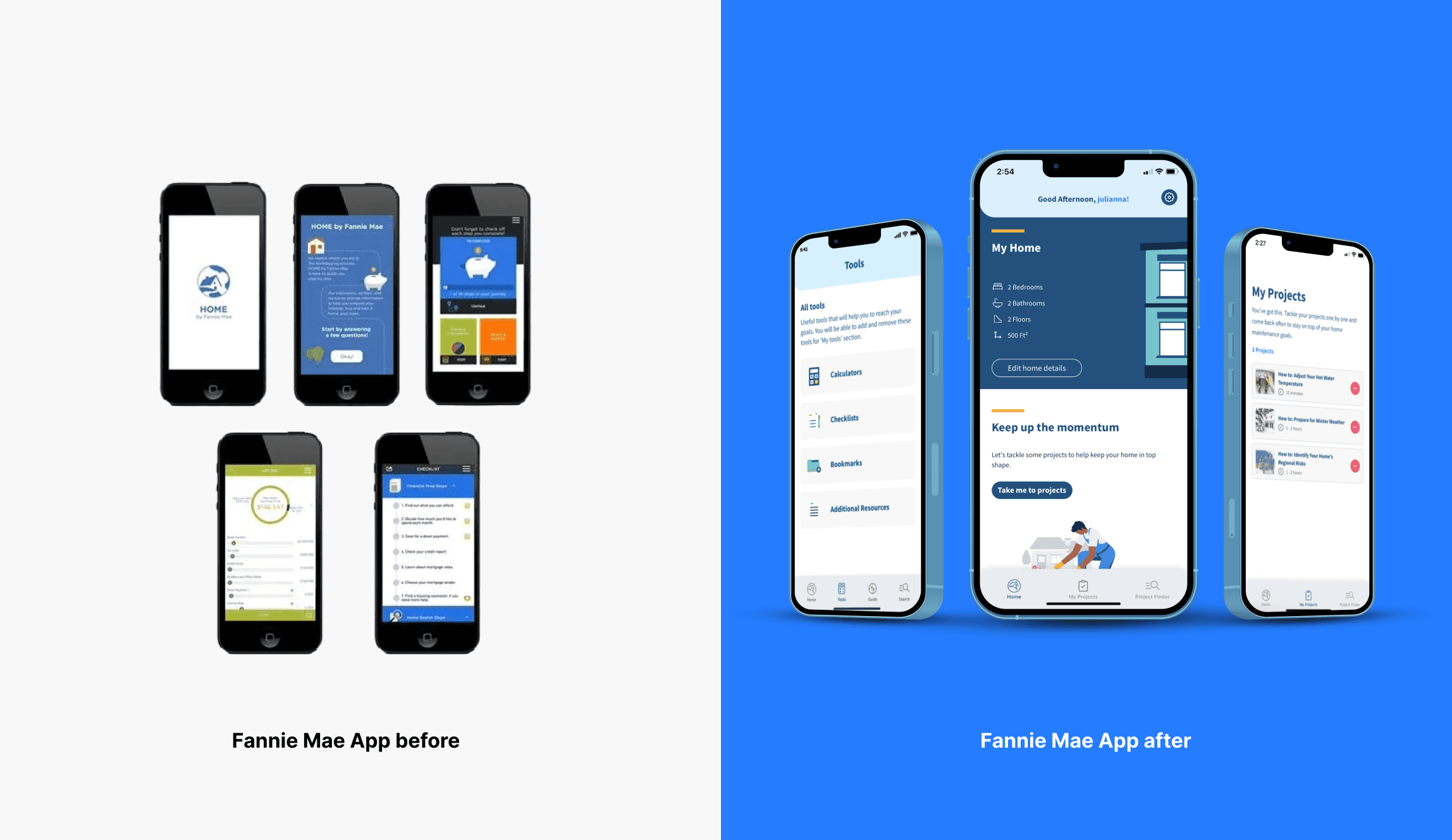
The Fannie Mae App had become an outdated resources in the app store and only served as a touch point to take users to a website with homebuying resources. The home-buying process is complicated and can be stressful for a lot of consumers, especially first-time home-buyers. Fannie Mae partnered with Matter Supply Co to work hand in hand with their marketing team to deliver a new version of the app.
Solution
An updated version of the mobile app consolidates all of Fannie Mae's consumer information into an easy-to-use pocket reference. This one-stop-shop provides prospective homebuyers with step-by-step instructions, tools, and advice for every stage of their journey, all from a trusted source. The app is especially valuable for low-income consumers who rely on their phones as their primary device, helping them navigate the home-buying process more easily, which aligns with Fannie Mae's mission.
Design Challenges & Process
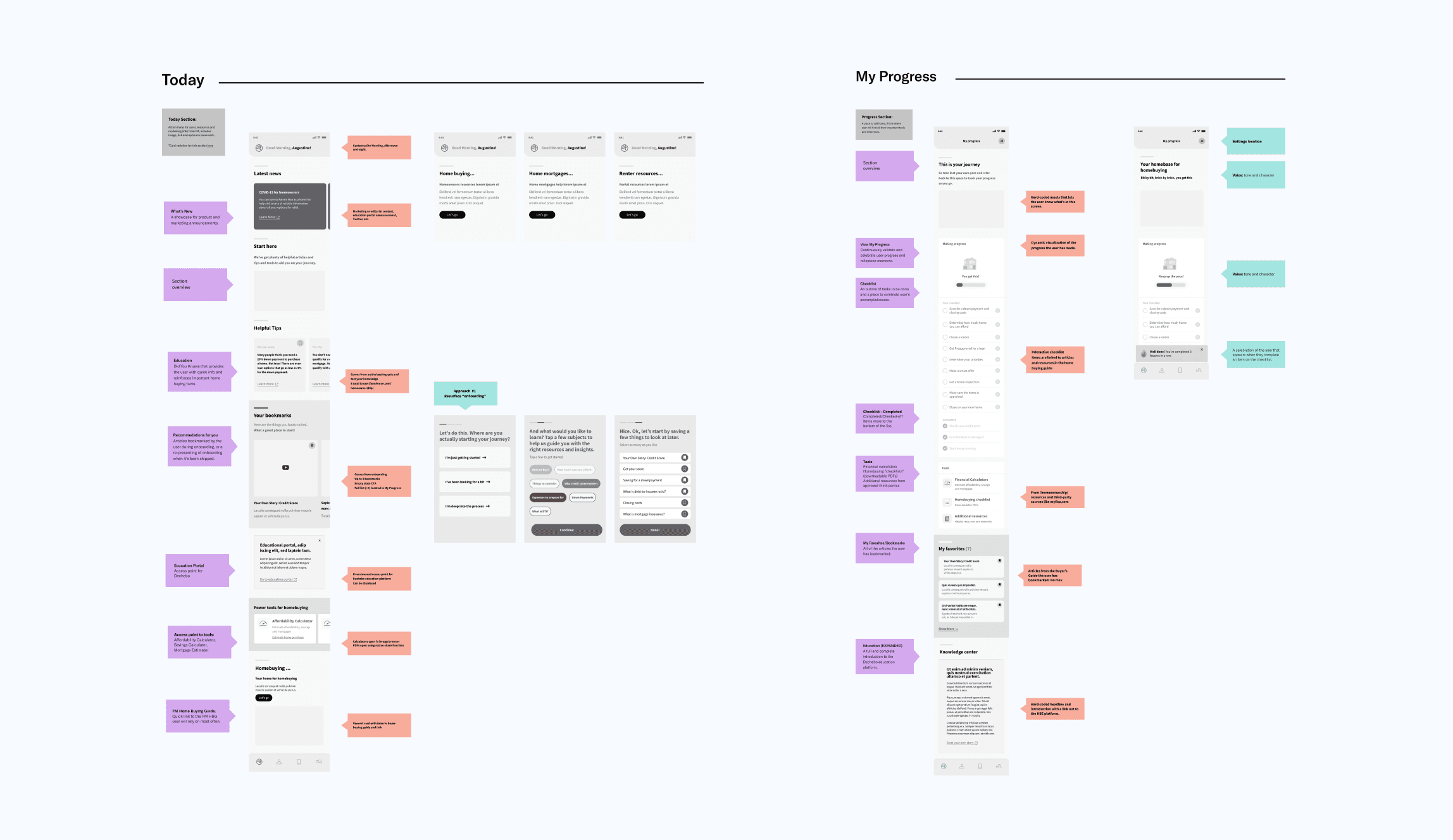
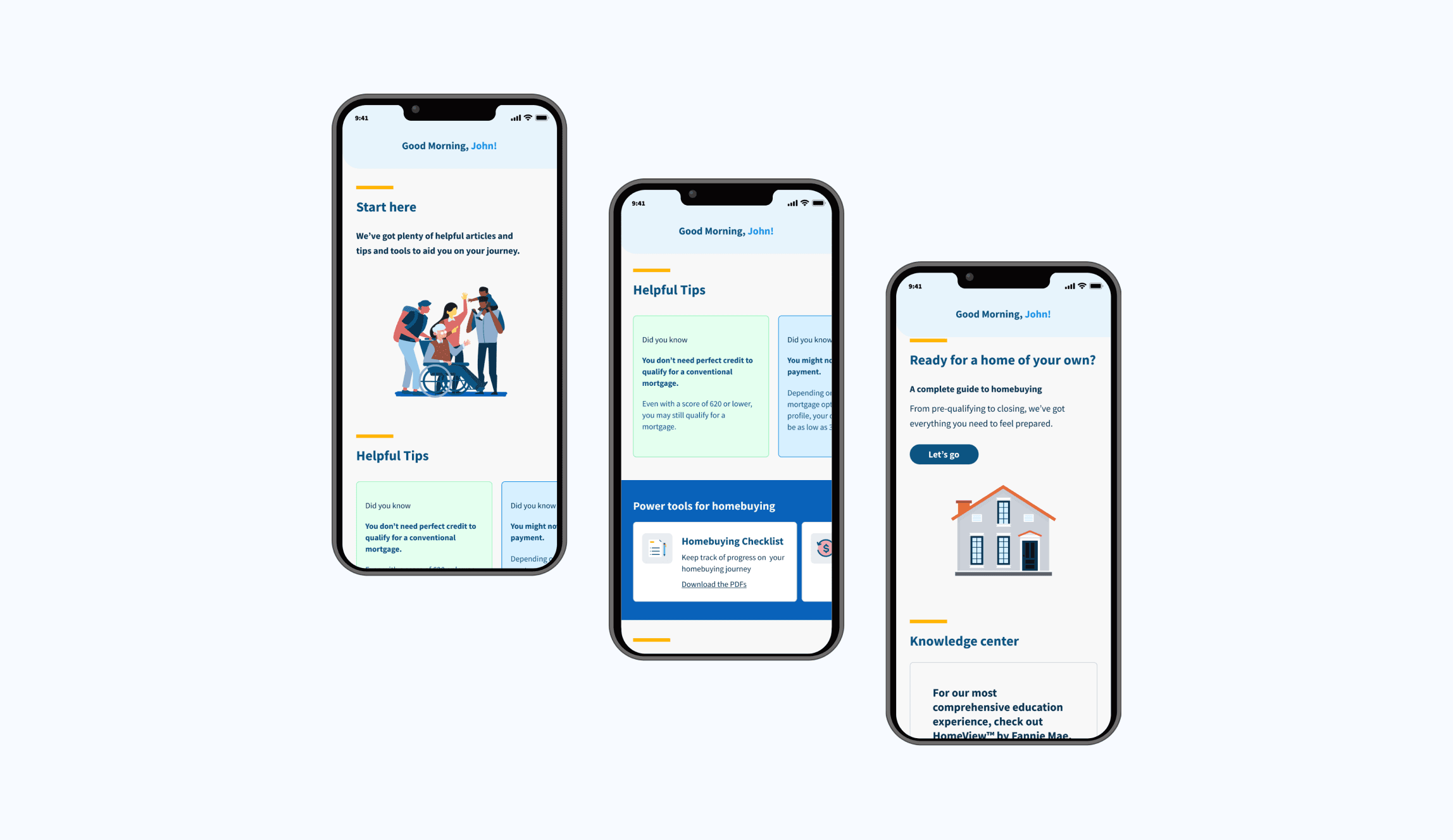
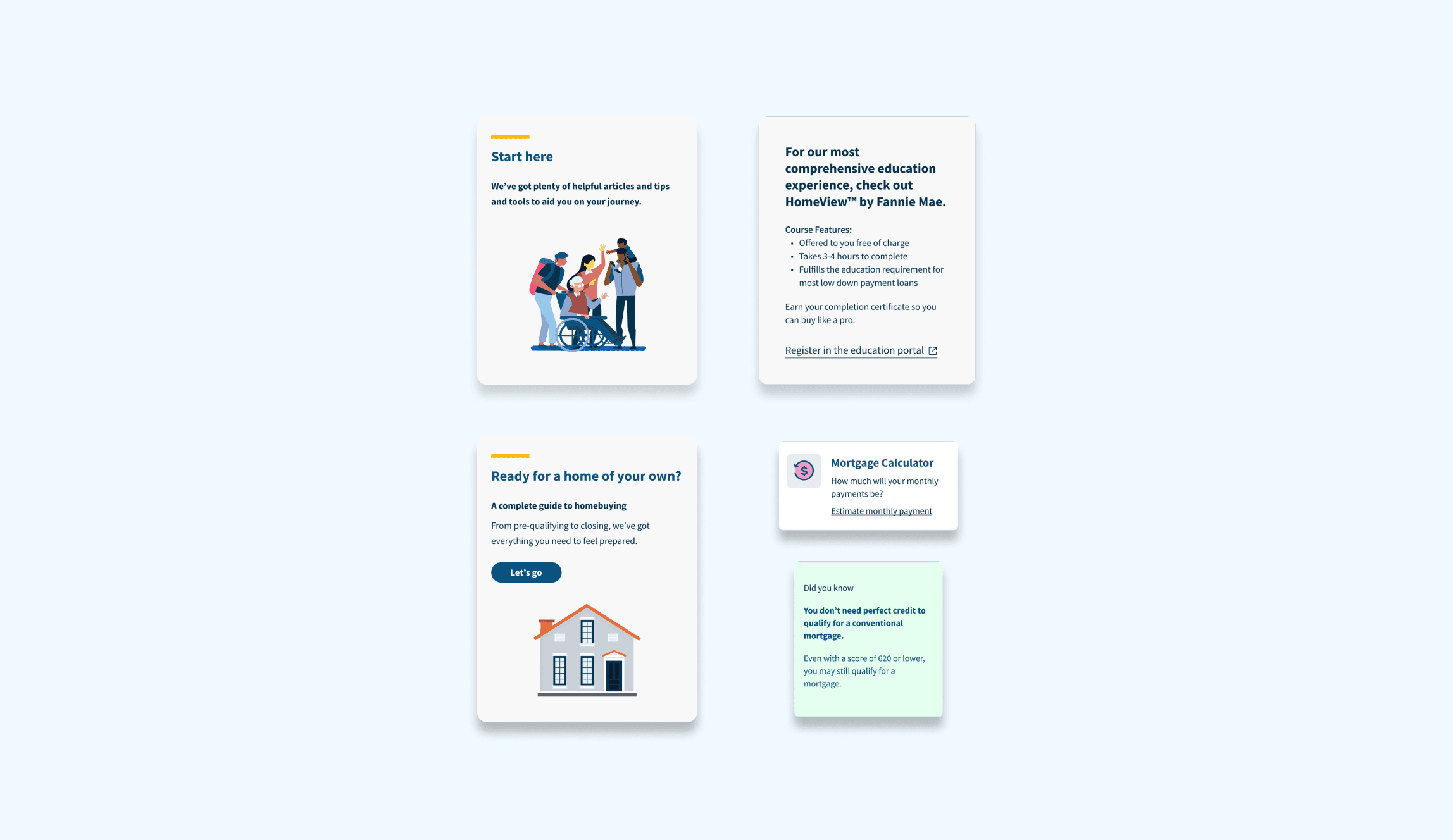
Wireframes: When I joined the project, the features were already decided. The Matter Supply was functioning as a partner of the Fannie Mae marketing and product team. I focused on redesigning the whole experience, such as the news feed, Progress tracker, and homebuying guides. I mainly worked on creating the news feed, the first screen users see after signing up. The difficulty was turning long articles into easy-to-read content so users could quickly understand and decide what to explore further based on their interests. The solution was a versatile card system for adding various content like information, images, and calls-to-action.
Other areas I worked on:
Search
Progress tracker
Today Feed
For theToday feed. I created a flexible card system that would allow us to expand or extract depending on the load of information needed. The news feed serves as the first section the user sees after onboarding and it provides a quick glance of the information available and snackable content.
Enhanced Tools for homebuyers
Situation
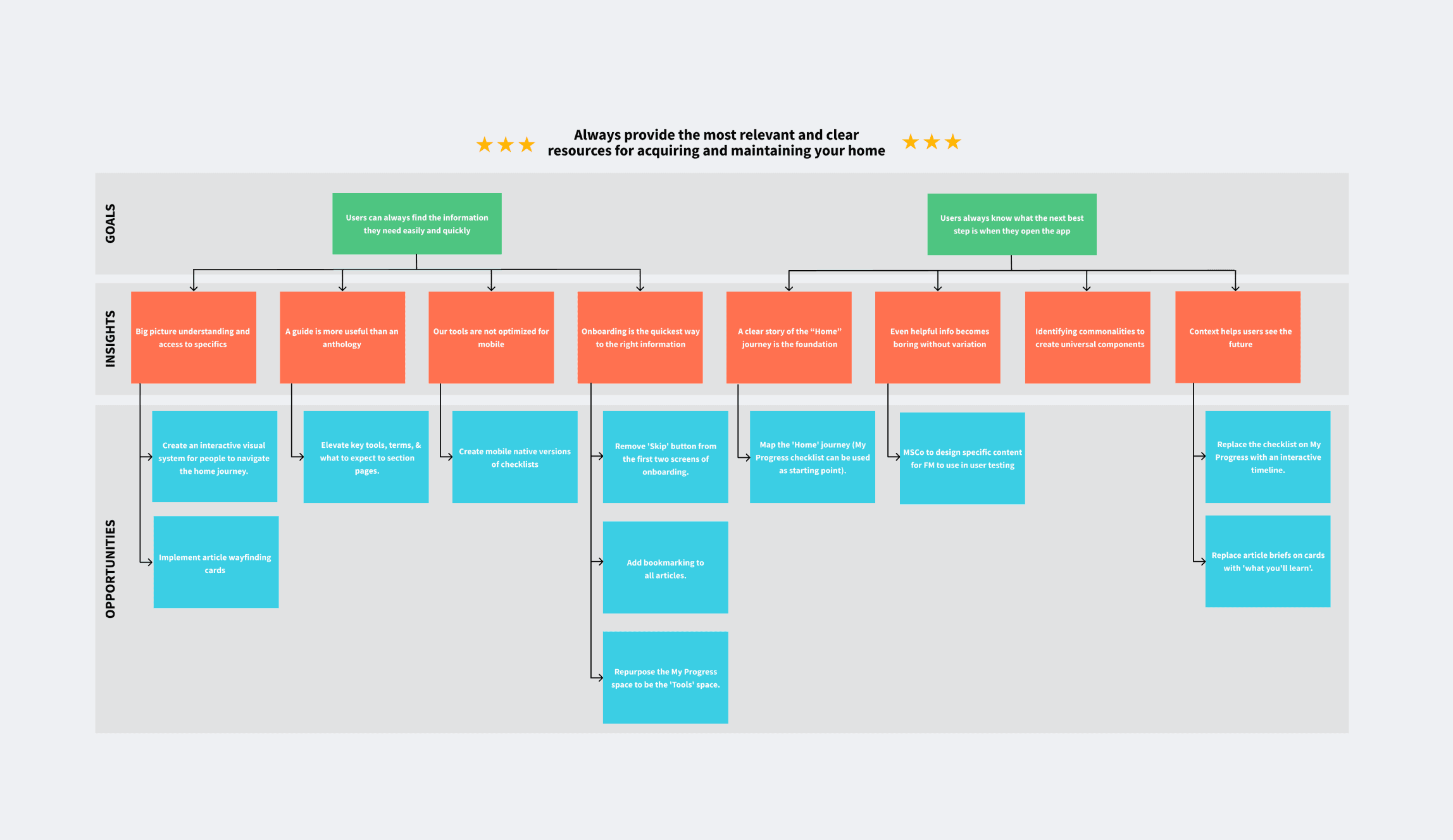
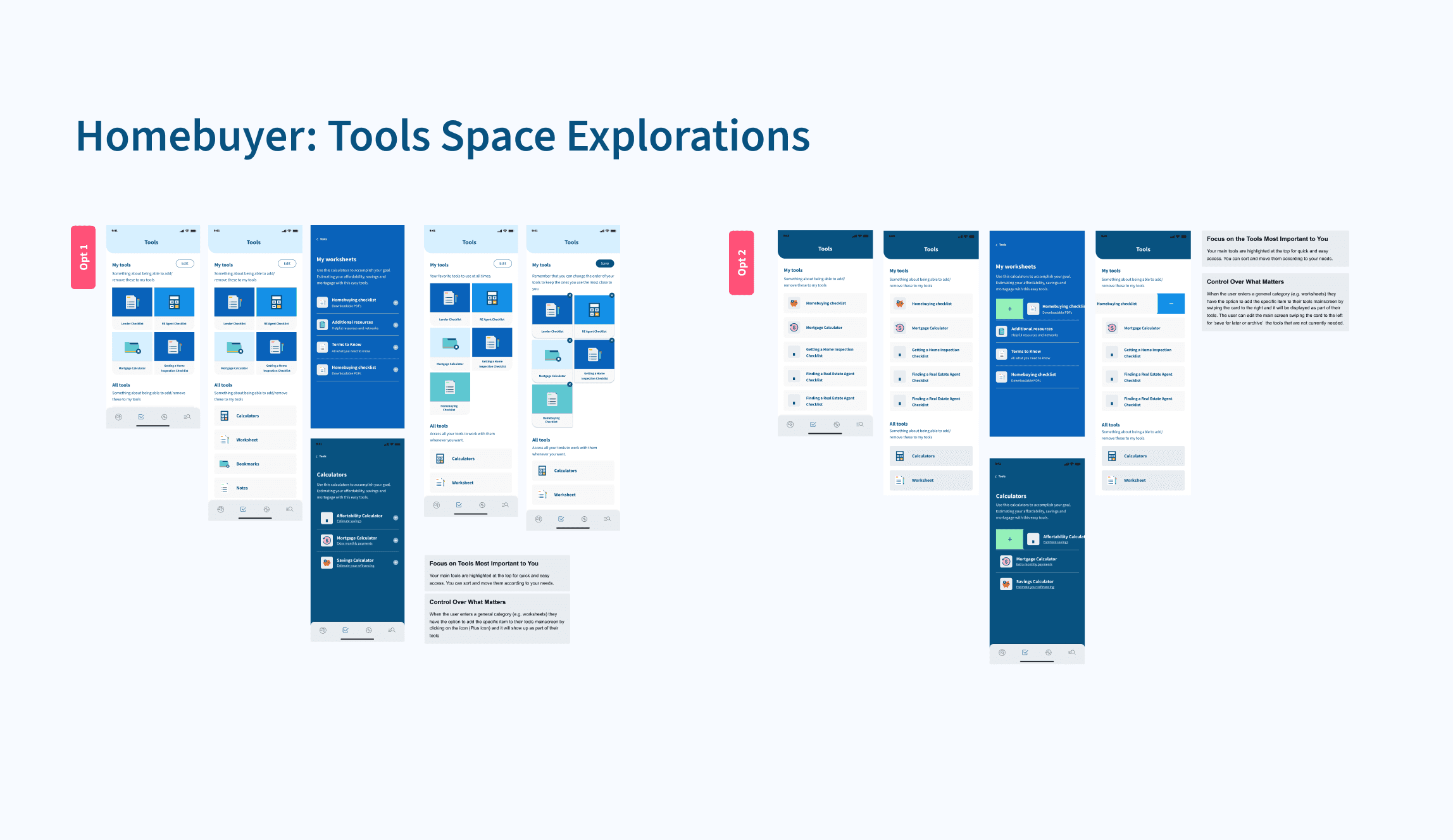
How might we support future homebuyers? After the Fannie Mae team finished UAT, the results showed that users wanted a space where they could pick and choose the tools and resources that are relevant to their journey, type of home and skills.
Solution
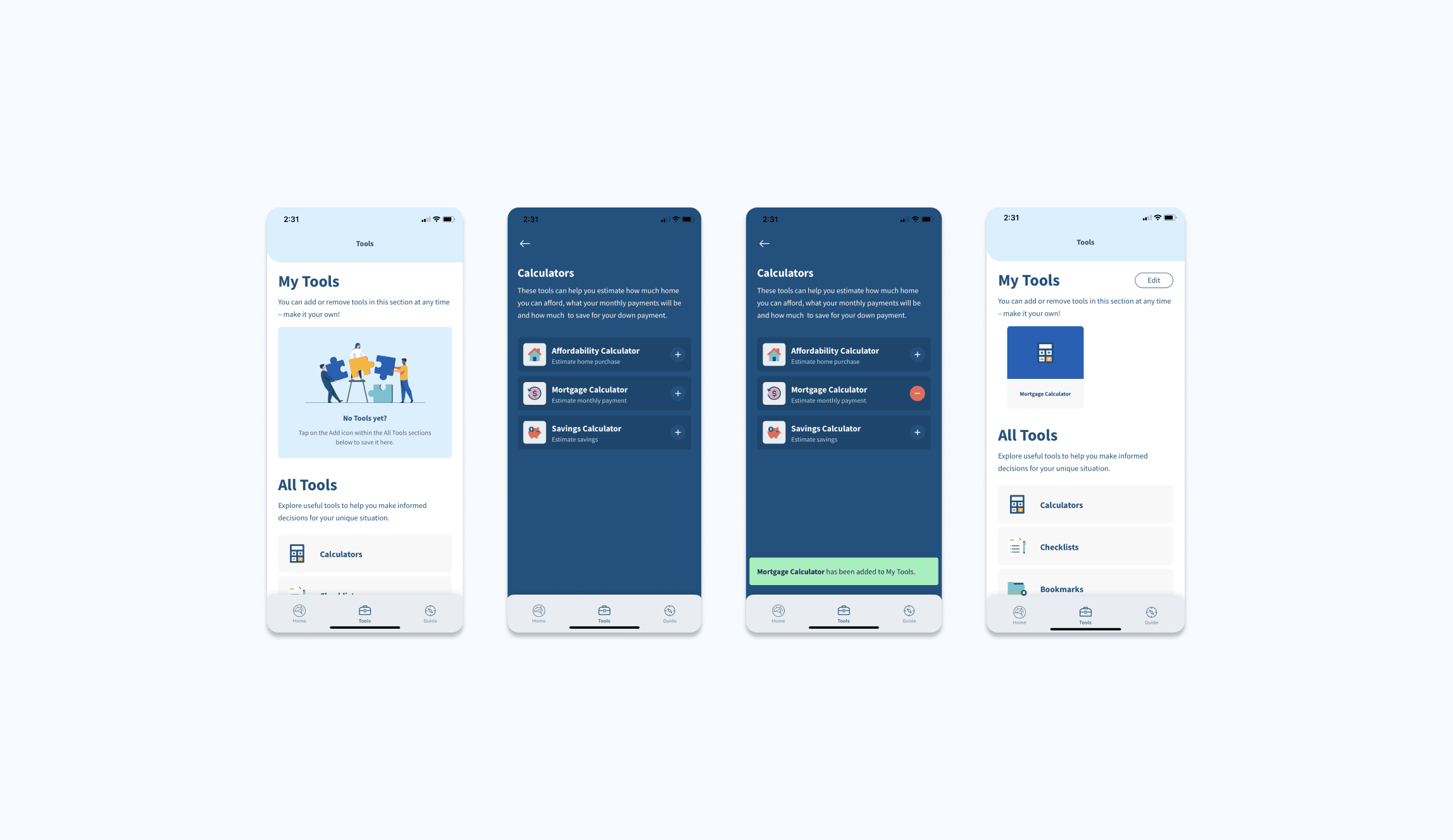
A fully customizable workspace where users can pick and choose the tools and resources that are relevant to their needs. They can easily brows and add/remove the tools and resources needed.
Home Improvement: Projects to Maintain Your Home
Situation:
New homeowners don't know what the next steps are when it comes to maintaining their home and in terms of design, I had to figure out how to easily show and guide users through the project list so they could easily pick out what's relevant to them. Some initial challenges included questioning how to take the user to the space, initially suggestion a quiz but quickly realizing that this required additional tasks for the user that could cause additional friction with an already overwhelming process.
Solution:
A fully customizable projects section that homeowners can browse and add to their project space with additional information, they can see at first glance the level of complexity of the projects and the category so they can determine what would work for them and/or if they would prefer to hire someone to complete this.
Visual Design & Design System
A look and feel that evokes ease and trust
Collaborated with the Senior UI Designer and Creative Director to present concept options for the product's look and feel. Agreed with the client on a "visual mood" that conveys calmness, approachability, and trustworthiness. The chosen direction builds on recognizable Fannie Mae elements and color scheme, emphasizing lighter tones and refined accent colors. Brand elements include iconic Fannie Mae blue, with touches of yellow and neutral colors.
Design System
To ensure consistency in UI, I cleaned up all the current and new styles and components. This ensured consistency in UI for the user, but also provided a much needed refresh for the internal team. This gave us the materials to streamline our communication from product, design, and engineering whenever referencing current tasks.
Conclusion
The homebuying process can be overwhelming and having resources available that support people in that journey is key. The app was well received by the Fannie Mae team, the app’s reviews improved on the app store and the overall sentiment amongst testers was positive.
One of the biggest lessons I took from the project was to always think beyond the “tasks” the user should acomplish and really take a moment to think and ask “how does this happen in the real world, what is missing and what can be better?”
Note: As of August 2024, the app has been paused on the app store but the resources remain available on Fannie Mae's website.
